I'm not going to discuss the whole oil disaster that's going on right now, but of all the links, pictures, parodies, bashes, political debates, etc, etc, etc, that I've seen, here are two serious maps that I thought showed some really good perspective. It's hard to imagine how big the spill is, but these maps show them from the best and worst possible lights.
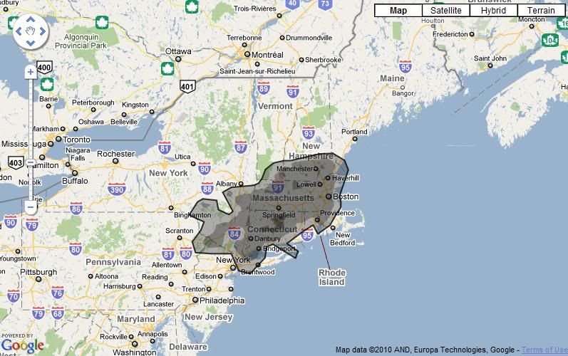
The first one, is If It Was My Home* which lets you put in your city and it'll overlay a black spot the size/shape of the oil spill. Most likely, it'll appear huge and crazy insane, like how it covers a few entire states in this one:
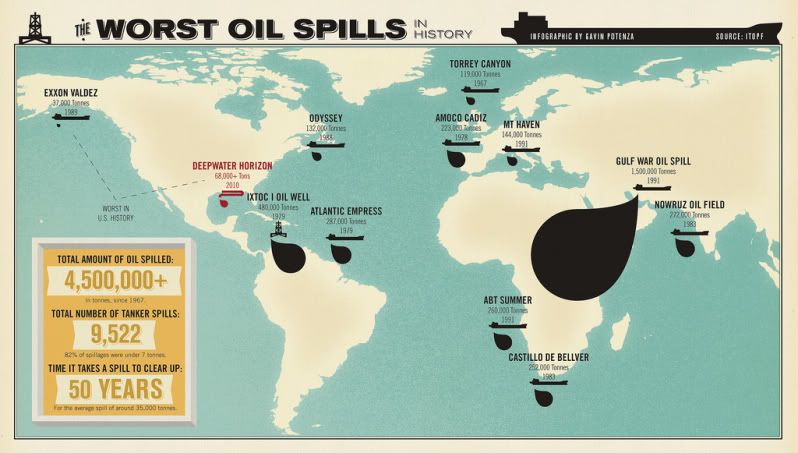
And the second, is of this map which shows a comparison of the world where previous oil incidents have occurred with their corresponding sizes.
*I'll pretend that it doesn't really bother me that,
grammatically speaking, it should be "If it *were* my home"...
The first one, is If It Was My Home* which lets you put in your city and it'll overlay a black spot the size/shape of the oil spill. Most likely, it'll appear huge and crazy insane, like how it covers a few entire states in this one:
And the second, is of this map which shows a comparison of the world where previous oil incidents have occurred with their corresponding sizes.
*I'll pretend that it doesn't really bother me that,
grammatically speaking, it should be "If it *were* my home"...


.png "Quirky Jessi on StumbleUpon")


Post a Comment